After a great run, the Winning the Internet blog has been retired. However, you can still keep in touch with New Media Mentors here.
Back in January we flagged the importance designing your email templates to be mobile friendly, plus a few resources to get you started. The bottom line being that mobile devices account for 12-17% of emails opened for non-profit organizations and it can be as high as 24%. Those figures will only grow over time. Depending on the complexity of your email template, you might be forcing your readers into a pretty bad experience.
We wanted to prove that this was something fairly easy for you to implement. So we decided to do this ourselves and then provide some guidelines for how you can approach your own templates. It actually took longer to write this post than to implement and test this stuff. Our template is fairly simple, no action call out boxes or anything like that. We’re currently running on Salsa which has its own unique quirks, but these tips apply across the board. I also wanted to thank Erik Leaver at United to End Genocide for throwing a few tips our way.
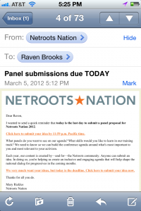
For starters, this is what an uncorrected email looks like on my iPhone.
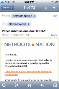
You can click for a larger version of that image. But it’s kind of hard to read, right? Imagine how much worse it would be if we had an action call out box like many organizations do. Now here’s the mobile optimized version of the same email.
Again you can click through for a larger version. We didn’t do too much here except shrink it to fit the size of a mobile phone. You can do additional things like increase font sizes and you can even change where elements are placed if you’ve got a more complex template. So let’s get into how you do this. If you want a full list of geeky tips and tricks I’d highly recommend checking out emailology. Campaign monitor also has an excellent post on how they did this for their much more complex newsletter.
First, you want to add a declaration in the head section of your email. That’ll look something like this section below, you’ll delete everything between the /* */ marks. As the emailology folks mention it’s very important to use ID declarations and not CLASS declarations.
@media only screen and (max-device-width: 480px) {
/* Here you can include rules for the Android and iPhone native email clients. ALWAYS USE IDs!!! The Android does not support “class” declarations. Here’s more info on that.Device viewport dimensions are as follows:
Iphone: 320px X 480px – portrait, 480px X 320px – landscape
Android:350px X 480px – portrait, 480 X 350 – landscape
(These are average dimensions, the Android OS
runs on several different devices)*/
}@media only screen and (min-device-width: 768px) {
/* Here you can include rules for the iPad native email client.Device viewport dimensions in pixels:
768 x 1024 – portrait, 1024 x 768 – landscape
*/
}
Next you’ll want to add some rules to these. What rules you add very much depends on your specific template. What we ultimately had to do was pretty simple. We shrunk the logo at the top of the email, and we set the table that bound all the content to be smaller. Our code looks like this:
@media only screen and (max-device-width: 480px) {
#layout {
width: 300px !important;
}#emailLogo {
width: 300px !important;
height: 23px !important;
}
}
It really can be that simple. What you’re looking for is things that have sizes in your template and you have to rewrite your CSS rules accordingly. Here are a few areas to consider.
Images
You’ve got two options here. 1) You can simply pop open your images in the image editing tool of our choice and scale them down to new sizes so you get the proper dimensions. I knew I wanted the logo to be 300px wide so I changed it accordingly so I could find the proper height. Or 2) you can actually create new images if yours doesn’t look good scaled for whatever reason. You can then use the alternate image in the mobile template. Email on Acid provides some code on how to do that.
Hide unimportant stuff
Chances are you’ve got stuff in your email template like a “view in your browser” link in case someone’s email client screws it up, social media sharing links, preference management links, and a footer.
Much of this is going to be irrelevant on a mobile device and you should consider hiding it. A “view in your browser” link typically appears near the top of most emails. In a mobile interface that makes it one of the first things your readers see, but it’s also irrelevant. It’s going to look the same in a browser as it will in their email client. So just ditch it.
You can turn stuff like this off by referencing the IDs for those sections and giving them a “display:none”.
Action call outs or other regions
If your email template has an action call out region or some other region other than the main body of your email you’ve got some decisions to make on the mobile front.
1) You could decide it’s not necessary to display that area on a mobile device and you could hide it. That’d simply involve referencing the ID for that section and adding a “display:none” element.
2) You might decide that you want to just move it below or above the content. You could do that by messing around with the floating for that section and you can probably simply add a “clear:both” element for that ID and it’ll appear below (or above) the content. But whether that’s all the surgery you need to do depends on how your template is built.
3) You might decide that you want to display something else entirely for your action section that’s more tailored to mobile users. For example let’s say you wanted to include a call to action button before your email content begins. You can do that in a similar way as item 1. In your main template you’d set that section to “display:none” and then in your mobile section you’d reverse that rule. As to whether that’d be effective you’d need to do some testing with your list.
On email tools
I’ve used a number of different email platforms and all of them are built differently. Some allow you to really easily do advanced stuff with templates and give you a great interface to interact with it. Some of them are much more raw. If you’re using one of the latter tools then if you move beyond the basics it’ll be necessary for your users to apply hacks to the template before they send each time. This is specifically the case with call to action boxes.
But it is in fact possible to do this, you just have to take more care to educate the people deploying emails for you and give them templates with clear instructions what to insert where. And of course make sure each email is tested before it’s deployed. It all depends on your needs and the skill of your staff.


Comments are closed.